ZEN

自然と職人が生み出す価値を軸に植物や器を提供する店舗の内装計画。

4坪という限られた空間の中でブランドの世界観を表現するために要素を削ぎ落としモルタルと銅板で空間を構成。

カウンターを覆うように天井と背面の壁には銅板を施し、それと呼応するように棚や什器にも銅板を使用している。要所に施された銅板は光の反応、見る角度によって濃淡が生まれその存在感が際立ち、銅板と対比するように施されたモルタルのなめらかな質感は全体での調和を取りながらもさらに銅板の存在感を際立たせている。

シンプルな構成ではあるがブランドの世界観を体現した、凛とした空間になった。

An interior design for a store that provides plants and vessels based on the value created by nature and craftsmen.

In order to express the world view of the brand in the limited space of 4 tsubo, the space was constructed with mortar and copper plates by scraping off the elements.

Copper plates are applied to the ceiling and back wall to cover the counter, and copper plates are also used for the shelves and fixtures to match the copper plate.The copper plate applied to the key point creates a light and shade depending on the reaction of light and the viewing angle, and its presence stands out. The smooth texture of the mortar applied to contrast with the copper plate further accentuates the presence of the copper plate while harmonizing the whole.

Although it has a simple structure, it has become a dignified space that embodies the brand’s view of the world.

MY CHAIR BOOKS

絵本やアートブック、コミック、小説、雑誌に文庫本、書籍以外にもCDやカセットの音源などをオーナーの好きを集めた書籍などのアイテムを通じてカルチャーを発信している小さな本屋さんの内装計画。

躯体のコンクリート高圧洗浄仕上や鉄骨はそのままに、区画を形成する壁を白い塗装を施したプレーンな空間の中にラワン合板の什器を配置しそれぞれの素材感、テクスチャーを感じとりやすく、訪れた人により親しみを与えることができるような店舗を目指した。

書籍やCDを陳列する什器は線や枠を意識したディテールとすることで、商品が陳列された際にそれぞれのアイテムに視線がフォーカスされる。

4坪という限られた空間の中でオーナーの好きを詰め込み、親しみを感じられるような店舗となった。

Interior design for a small bookstore that transmits culture through items such as picture books, art books, comics, novels, magazines, paperbacks, CDs, cassettes, and other items that the owner likes.

The concrete high-pressure washing finish and steel frame of the frame are left as they are, and the lauan plywood fixtures are placed in a plain space where the walls that separate the tenant compartmennt are painted white, making it easy to feel the texture and feel of each material, making it more familiar to visitors. We aimed to be a store that can give.

The fixtures that display books and CDs are made with details that are conscious of lines and frames, so that when the products are displayed, the eyes are focused on each item.

In a limited space of 4 tsubo, the owner’s favorites are packed into the store, making it a store that feels familiar.

SUNCA

カフェを併設した服とアウトドア用品を扱う物販店の内装計画。今回の店舗が初出店というところで来客者にSUNCAのメッセージがより伝わるような空間を意識して計画した。またクライアントからは多様な商品と多様なシーンに耐えうる機能と上質さ、強度を持ったお店が求められた。

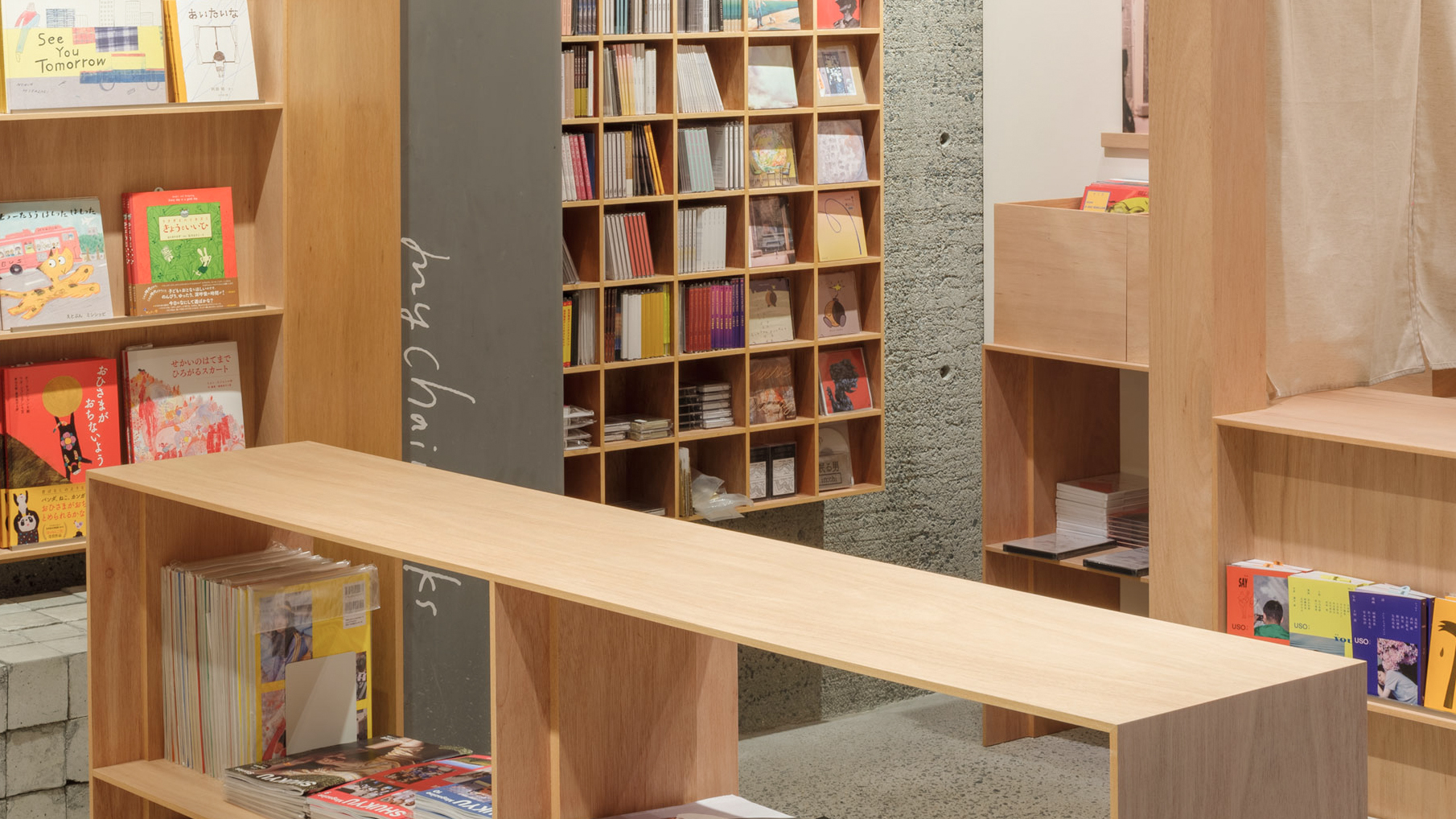
天井にレールを設けそこに吊るされた什器は前後自由に動き、棚も上下高さの変更が可能なシステム什器をベースの什器として配置。ある一定の規則の中での変化が可能なことで強度を保った中での多様な商品、多様なシーンに対応ができる什器となっている。

壁面には角棒を一定の間隔で横、縦、横とレイヤー状に配置しグリッドを構成。レイヤー状に重ねたグリッドに生まれる角の穴に対応するハンガーパイプや棚などの複数種類のパーツを制作。パーツを差し込むことで如何様にも変化するシステム什器としている。

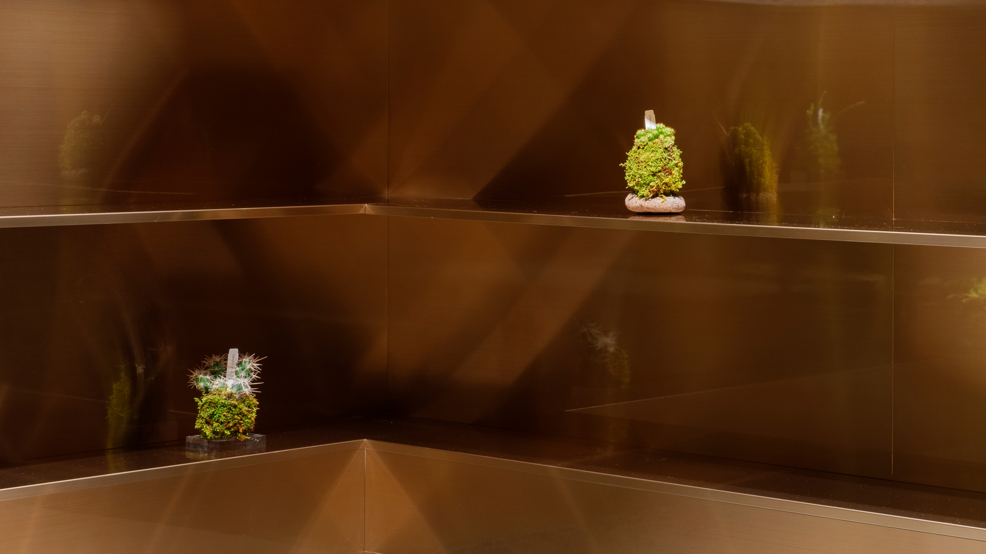
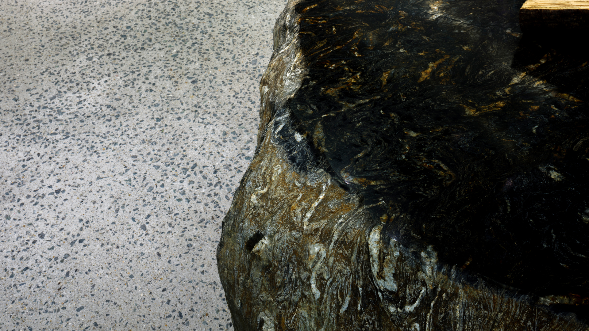
カウンターや什器の素材をステンレスで統一し、岩や苔などを配置することで人工物と自然物が混合した空間としSUNCAのもつブランドのメッセージを表現し上質さと強度をもつ空間とした。

また今回の区画位置が施設のメイン動線と重なっていることから動線と施設の奥までの視線を確保することが求められた。

メイン動線を確保し、このメイン動線を基点に左は物販、右はレジ、テイクアウトと左右で機能を分けた平面構成として計画した。

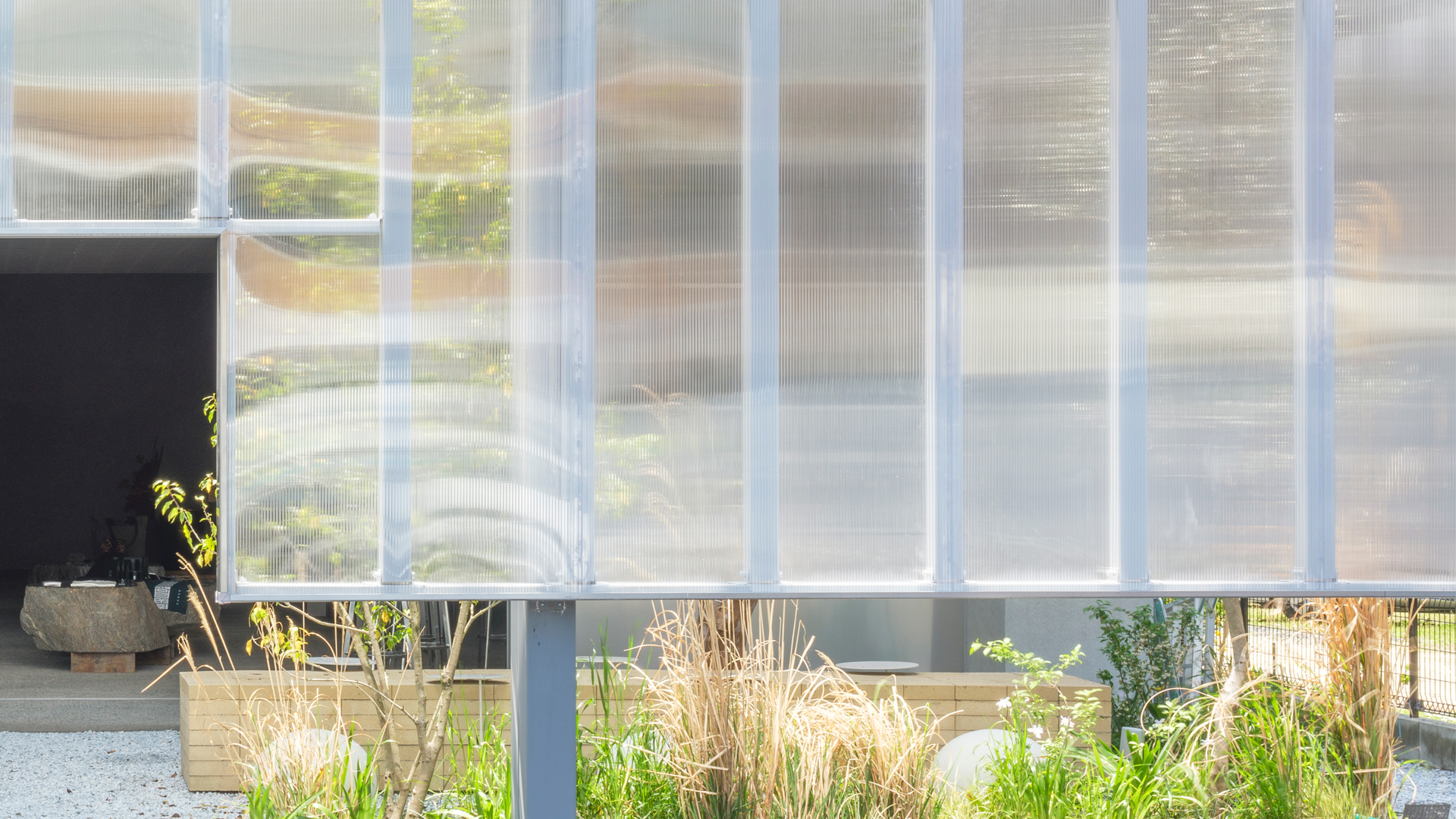
隣接した中庭と合わせ季節ごとに見せ方と空間が変化し続ける可動性と可能性をもった店舗となった。

Interior design for a store with a cafe that sells clothing and outdoor goods.Since this store is the first store to open, I was conscious of planning a space that would convey SUNCA’s message to visitors.In addition, the client requested a store with functions, quality, and strength that can withstand a variety of products and a variety of scenes.

A rail is installed in the ceiling, and the furniture hung on it can move back and forth freely, and the system furniture that can change the height of the shelves is placed as the base furniture.It is a fixture that can be flexible changed within a certain rule and can be used for various products and scenes while maintaining its strength.

On the wall, square bars are placed in layers horizontally, vertically, and horizontally at regular intervals to form a grid.Created multiple types of parts such as hanger pipes and shelves that correspond to the holes in the corners of the layered grid.It is a system fixture that changes in any way by inserting parts.

By unifying the materials of the counter and fixtures with stainless steel and arranging rocks and moss, we created a space where man-made and natural objects are mixed, expressing the message of SUNCA’s brand and creating a space with quality and strength.

In addition, since the location of the block this time overlaps with the main flow line of the facility, it was required to secure a line of flow and a line of sight to the back of the facility.

We secured the main flow line, and based on this main flow line, we planned a planar configuration that divided the functions into left and right, such as product sales on the left and cash register and takeout on the right.

Combined with the adjoining courtyard, it has become a store with mobility and possibility that the presentation and space will continue to change with the seasons.

243

自然を楽しむことをテーマにした複合型商業施設の新築計画。計画地は施設のテーマとは異なり国道と隣接し周囲にはアパートやスーパー、ドラックストアに囲まれた日常に振れた環境下での計画。非日常と、テーマである自然を感じることができる商業施設を求められた。


非日常、自然を感じるという環境を作る上で外部環境を取り込むことが効果的にならないため、まずは外部環境と内部環境を隔てるようにコンクリートの壁を周囲に配置することで施設に入ると施設に集中できるような場とした。

さらに建物の間に中間領域となる中庭や通路を設けることで、周辺環境の視覚的なノイズを遮断し、中庭から自然光を取り込むことで日常からの遮断と自然を感じることができる空間の両立を目指した。


中間領域である中庭と外部環境を隔てる壁として視界は遮るが光を通す物質としてポリカーボネートを使用することで、自然光を取り入れながら視覚的なノイズを遮り明るく自然を感じる空間とした。

来訪者が施設に入ったときに日常から切り離され施設に集中し豊かな時間を過ごせるような空間になることを目指した。


A new construction plan for a commercial complex with the theme of enjoying nature.

Unlike the theme of the facility, the planned site is adjacent to the national highway and is surrounded by apartments, supermarkets, and drug stores.

There was a need for a commercial facility where you can feel extraordinary space and feel the theme of nature.

Incorporating the external environment into the surrounding environment is not effective in creating an environment where you can feel theme, so first place a concrete wall around it so as to separate the external environment from the internal environment. When you enter the facility, you can concentrate on the facility.

In addition, a courtyard and aisle, which are intermediate areas, were provided between the buildings to block the visual noise of the surrounding environment and separate the daily life, and by taking in natural light from the courtyard, both the blocking from the daily life and the space where you can feel nature were achieved.

Polycarbonate was used as the wall that separates the courtyard, which is an intermediate region, from the external environment. The reason is that polycarbonate takes in natural light and blocks visual noise to create a bright and natural space.


We aimed to create a space where visitors can spend a rich time by being separated from their daily lives and concentrating on the facility when they enter the facility.