ソフト開発、支援などのIT関連事業を行っている会社の増床に伴う内装計画。
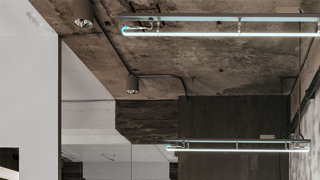
スタッフが心地よく働くことのできる場と本社の改装ということで機能性だけではなく旗艦としてコーポレートアイデンティティを伝えることのできる空間が求められた。
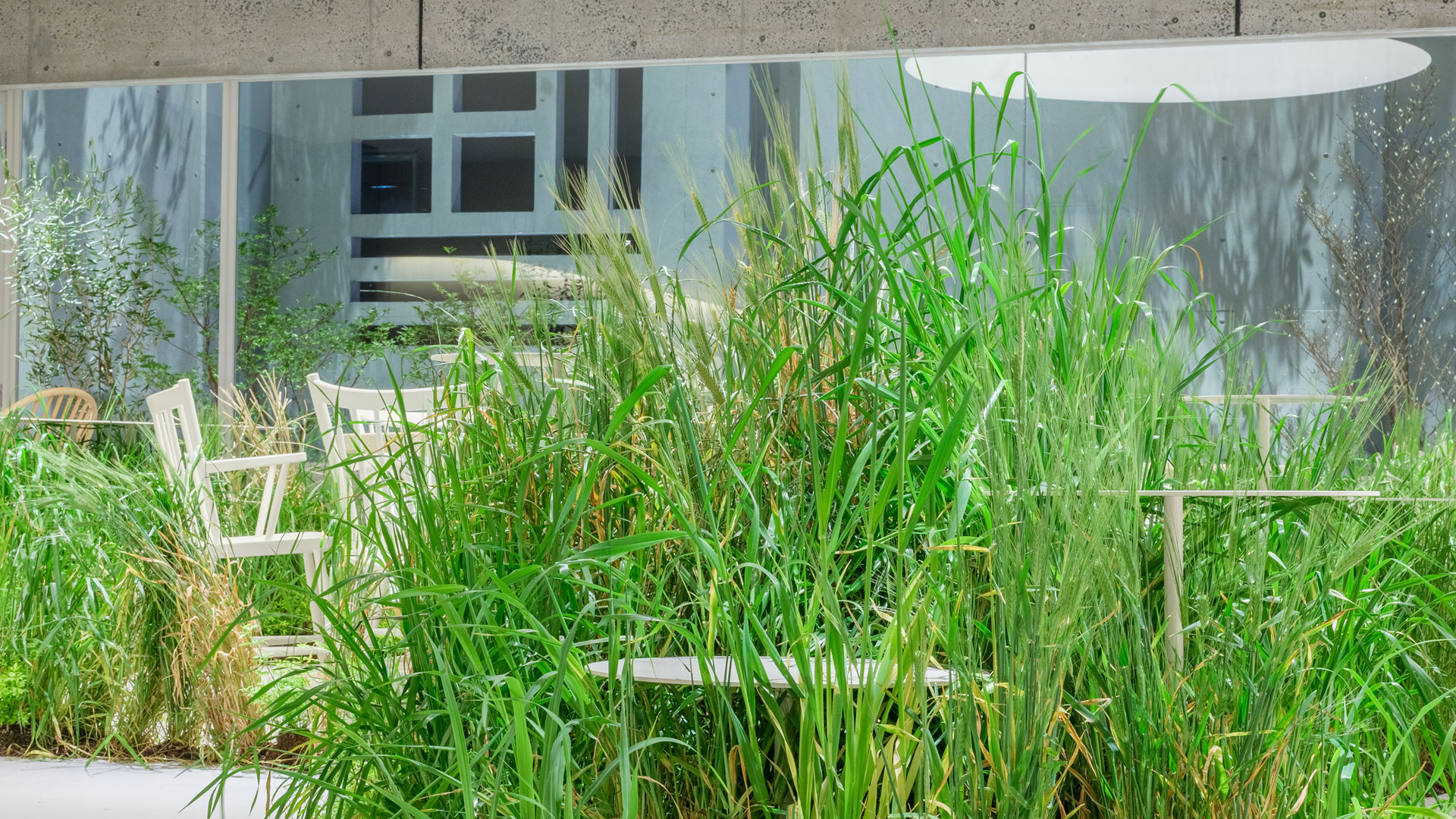
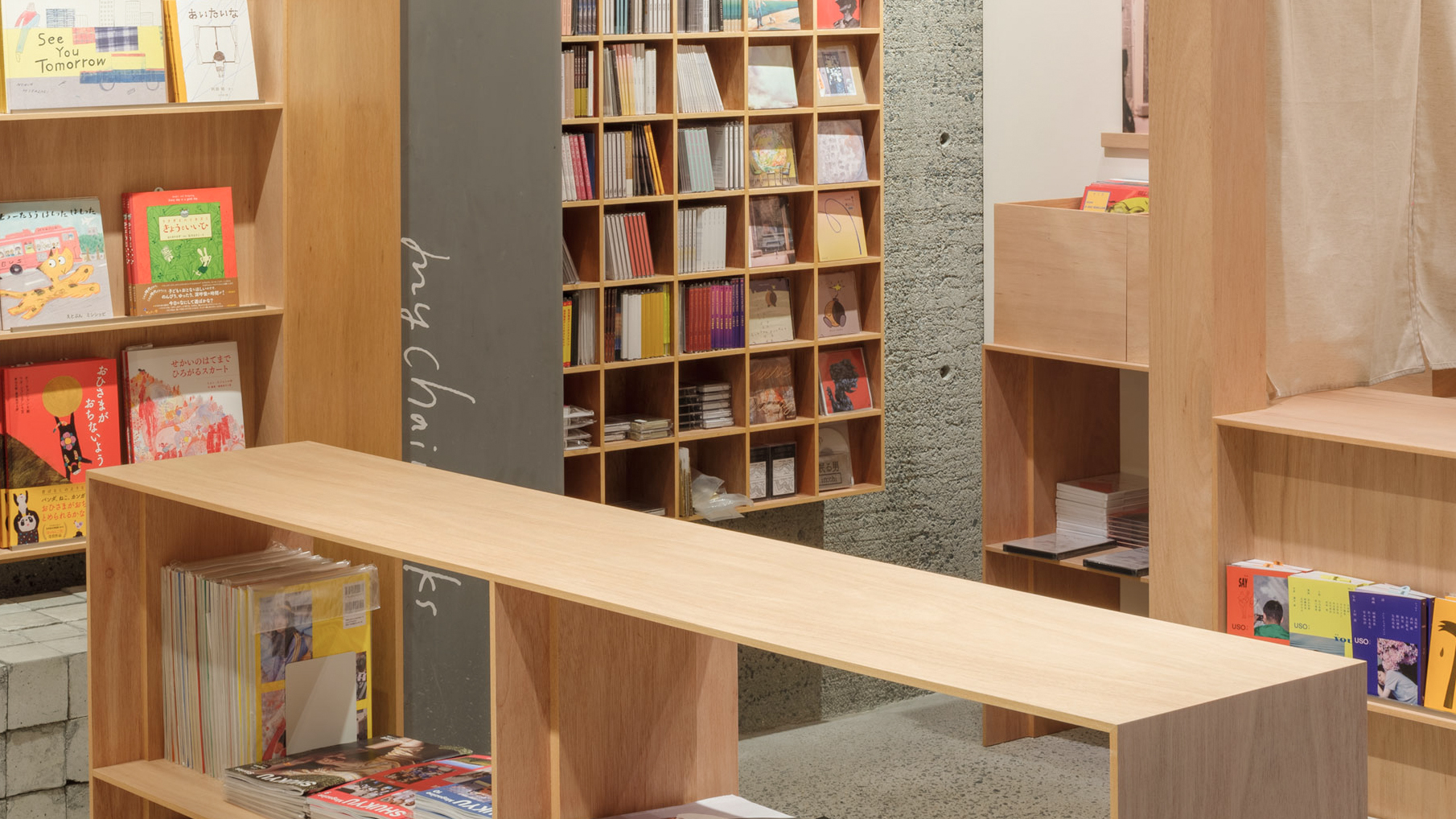
オフィスで求めらめられる心地よさというところで作業に適した場、アイディアを出す時に適した場、リラックスする時に適した場など行動に促した場や家具が必要だと考え様々な状況に適した多様な場、多様な家具を配置しそれぞれをゆるやかにゾーニングし交流と集中が心地よくできるような空間を目指した。
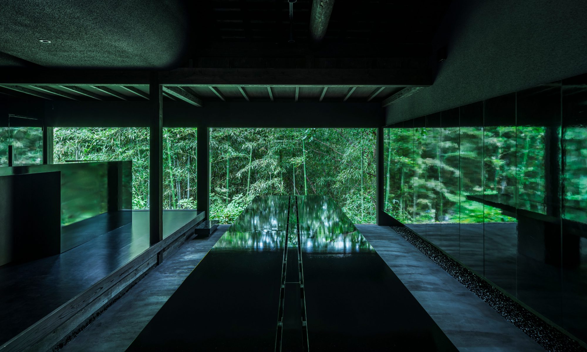
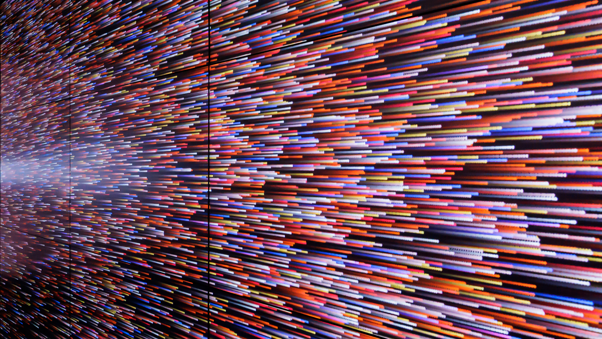
エントランスではデジタルウォールが来訪者を迎え入れる。システナのアイデンティをコンテンツで表現。通路ほどの広さ、コンテンツが浮かび上がるような黒い空間はデジタルウォールに包まれるような空間体験を生み訪れた人の記憶に残るようなエントランスとなった。
Interior planning for an expansion of floor space for a company engaged in IT-related businesses such as software development and support.
As the company was renovating its headquarters and a place where its staff could work comfortably, it needed a space that was not only functional but also capable of conveying its corporate identity as a flagship.
Considering the comfort required in an office, we believe that we need spaces and furniture that encourage action, such as a place suitable for working, a place suitable for generating ideas, and a place suitable for relaxing. We created spaces suitable for various situations and arranged a variety of furniture. By gently zoning these areas, we aimed to create a space where interaction and concentration can be carried out comfortably.
At the entrance, a digital wall welcomes visitors. Expressing Systena’s identity through content. The black space, which is as wide as a hallway and where the content appears, creates a spatial experience that feels like being surrounded by a digital wall, creating an entrance that will remain in the memories of visitors.