HOUSE_01

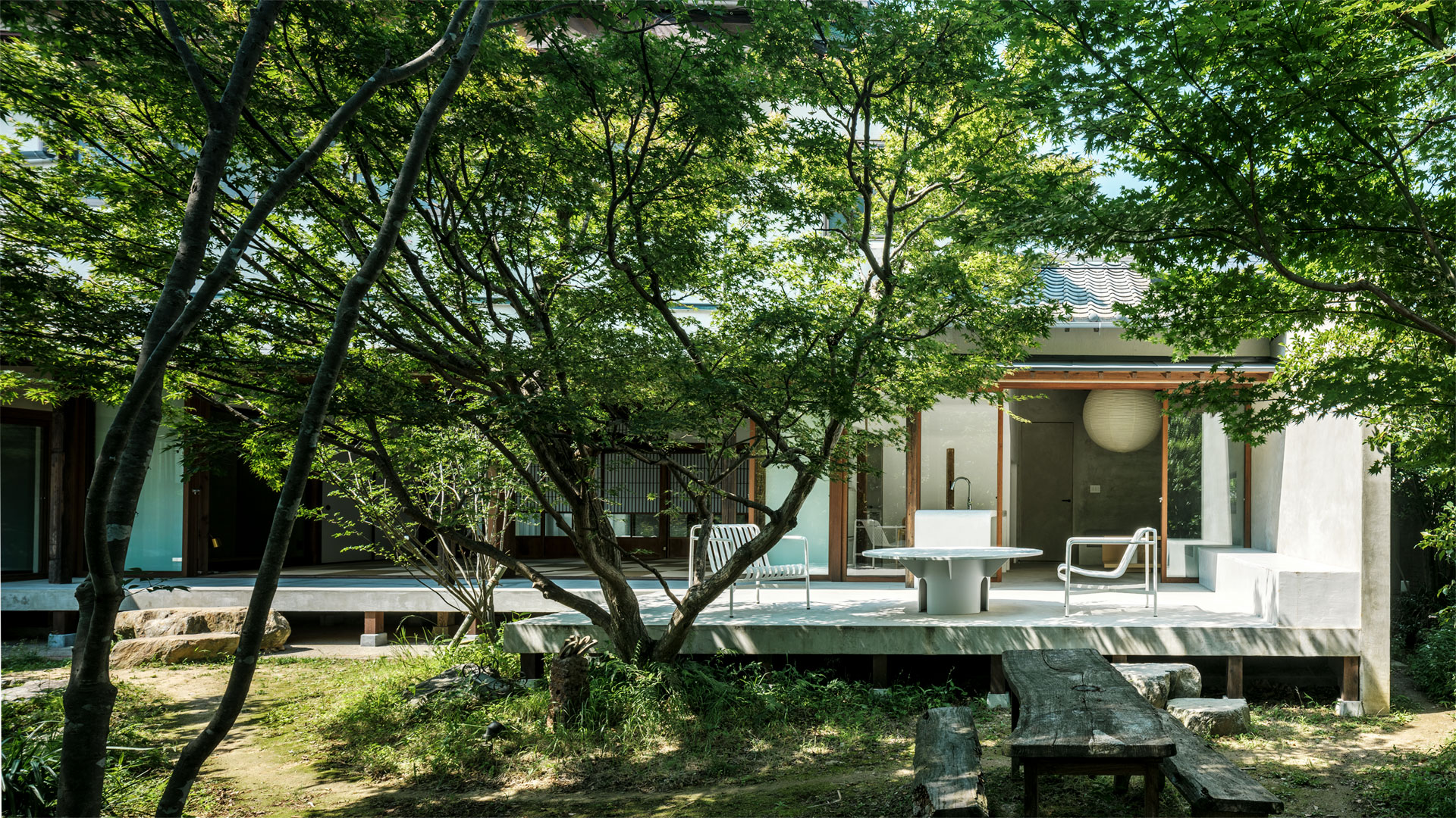
築80年の日本家屋の改修計画。既存の状態は居住者が移り変わる中で増改築が繰り返され、時代やその時々の居住者の趣向で統一感なく施された内外装やサッシは日本家屋の良さを失っていた。また大きく眺望の良い中庭があるものの中庭と家とが切り分かれた状態となっていた。

そんな状態の中、既存の状況を生かすこと、庭を眺むことができる空間、心地よく人が集まる場が求められた。

庭側の壁面、サッシを解体。元々広縁としてあったスペースを縁側とし、全ての部屋に引き込みサッシを設置。内と外をつなぎ、全ての部屋から中庭との一体感、開放感を感じる空間を目指した。またこの縁側をリビング、和室、寝室とを外からも繋げることで導線を設けあらたに回遊性のあるレイアウトとしている。

リビングにはテラスまで続く簡易的なキッチンカウンター 、ソファベンチを設けることで内と外をつなげ、人の意識を中庭へと広げ心地よい時間の流れを感じる場となった。

増改築で付け足された内外装を解体する中ででてきた柱や梁を生かし、床や壁などの素材には比較的空間に主張の少ないモルタルと漆喰を選び空間を整えた。施されたモルタルと既存の柱と梁の素材感から時間の対比が垣間見え上質で心地よい空間となった。


A plan to renovate an 80-year-old Japanese house.
The existing condition was repeatedly expanded and renovated as the residents changed, and the interior and exterior and sashes that were given without a sense of unity according to the times and the tastes of the residents at that time lost the goodness of Japanese houses.

Under such circumstances, there was a need for a space where people could gather comfortably, taking advantage of the existing situation, and having a view of the garden.

The outer wall on the garden side and the sash were dismantled. The space that was originally a broad veranda lines was changed to the veranda, and open lead-in windows were installed in all rooms.
We aimed to create a space where you can feel a sense of unity and openness with the courtyard from all the rooms.In addition, the veranda is connected to the living room, Japanese-style room, and bedroom from the outside to create a flow line, creating a new layout with ease of migration.

In the living room, a simple kitchen counter leading to the terrace and a sofa bench were installed to connect the inside and the outside, spreading people's consciousness to the courtyard and feeling a comfortable flow of time.

Taking advantage of the pillars and beams that came out during the dismantling of the interior and exterior that were added in the extension and renovation, we chose mortar and plaster for the materials such as floors and walls, which have relatively few claims in space.The texture of the mortar and the existing pillars and beams gives a glimpse of the contrast of time, creating a high-quality and comfortable space.

PARK LABO.


NTTコムウェア のコミュニケーションスペース。社内外の人が集まり共創することのできる環境がもとめられた。


人が集い憩う公園の在り方をヒントにレイアウトを構成し、集中の度合いでゾーンを分け求められる機能を配置した。


ヒトが集い憩う場、モノが創出される場として「公園」、「研究施設」これらの2つの要素をそれぞれ切り取り空間の中で掛け合わせることを表現の切り口とした。植栽、タイルやブロックで構成することでやわらかに外部環境を取り入れ、面発光を中心に照明を構成することで研究施設を象徴しながら陰影柔らかな心地の良い空間づくりを目指した。

2つの要素を掛け合わせ構成することで随所に心地の良い場をつくり全体的に爽やかで印象の良い空間となった。


Communication space of NTT Comware. An environment was sought where people inside and outside the company could gather and co-create.


The layout was constructed with a hint of how the park should be where people gather and relax, and the zones were divided according to the degree of concentration, and the required functions were arranged.

A place where people can gather and relax, and a place where things are created, “park” and “research facility”. Tried perspective of expression was multiply these two elements in space.

We aimed to create a comfortable space with soft shadows while symbolizing the research facility by composing the lighting with a focus on surface emission, while taking in the external environment softly by composing with plants, tiles and blocks.

KOZO KEIKAKU ENGINEERING


建物の構造設計から自然と環境の解析、シミュレーションや情報通信分野でのソフトウェア開発、製造分野へのCAD/CAEのソフトウェア販売やカスタマイズなどエンジニアリングを軸に多岐に渡る事業を行う会社のオフィス移転に伴う内装計画。多岐に渡る事業部門があるため部門を超えた日常的な会話や連携を取ることのできるようなコミュニケーションを促進する環境が求められた。


領域を設け多様な場を点在させることで領域を往来するような平面計画とし、空間にメリハリを与え自然とワークスタイルによる思考の切り替えが行われ、人が交流し会話や連携が促進するような計画とした。

障子や格子などを引用し空間に落とし込むことで領域を分けながらもつながりを感じるような空間とし、構造を魅せるような意匠また要所で構造材であるLGSや床の中の構造を魅せるような意匠とすることでブランドアイデンティティが間接的に訴求するような構成としている。


Planned the interior to accompany the relocation of an company that conducts a wide range of businesses centered on engineering, such as structural design of buildings, analysis of nature and environment, software development in the field of simulation and information and communication, software sales and customization of CAD / CAE to the manufacturing field.Since there are a wide variety of business divisions, an environment that promotes communication that enables daily conversations and collaborations across divisions was required.


Areas are set up and various places are scattered. The plan was designed so that people would come and go in that area, and the space would be well-modulated, the thinking would be switched naturally according to the work style, and people would interact and talk and collaborate.


By quoting shoji screens and lattices and arranging them in the space, we designed the space so that you can feel the connection while dividing the area, and convey the charm of the structure. In addition, the design is designed so that the LGS, which is a structural material, and the structure inside the floor can be seen at key points, so that the brand identity can be indirectly appealed.

DENSO CREATE


車載ソフトウェア開発を行う会社のオフィス移転に伴う内装計画。コミュニケーションを促進し、社員が働き方を考え働き方をアップデートしていくことができる環境が求められた。


3フロアある中の中間の1フロアに会議、セミナー、パンントリー、リラックスができる機能を配置。またレールを設置し、ホワイトボード、透過の可動パネルを配置。さまざまなシーンに合わせ自由にパネルを配置することで区画の形成ができるような計画とした。


部分的に既存のスチール性のOAフロアを利用、既存のシステム天井のパネルを抜いたハーフスケルトンにすることで空間に境界線を生み機能を明確化した。また可動パネルのレールの上にアッパー照明、ソファにR形状を使用することで硬質な空間を柔らげ、ブランドカラーを点在させることで単調な空間にリズムを生みだしている。


自由度の高い規格の中で使い方を考え主体的に行動することで活発な議論、コミュニケーションの促進、新たなアイディアへとつながり社員と企業が成長していく空間になることを目指した。


Planned the interior to accompany the relocation of an in-vehicle software development company office.An environment was required that promoted communication, allowed employees to think about work styles, and update work styles.


In order to gather people, we have arranged functions for meetings, seminars, pantry, and relaxation on one of the three floors.In addition, rails will be installed, whiteboards and transparent movable panels will be placed. Panels can be freely arranged to form a space according to various scenes.


In order to create a new boundary in the space and clarify the function of the space, the existing steel OA floor was partially used to create a place where the existing system ceiling panel was removed.In addition, upper lighting on the rails of the movable panel and the use of an R-shape for the sofa soften the hard space.Brand colors are scattered throughout the space to create rhythm in a monotonous space.


By thinking how to use it in a highly flexible standard and acting independently, we aimed to promote active discussion and communication, create new ideas, and create a space where employees and companies can grow.

F&M net.


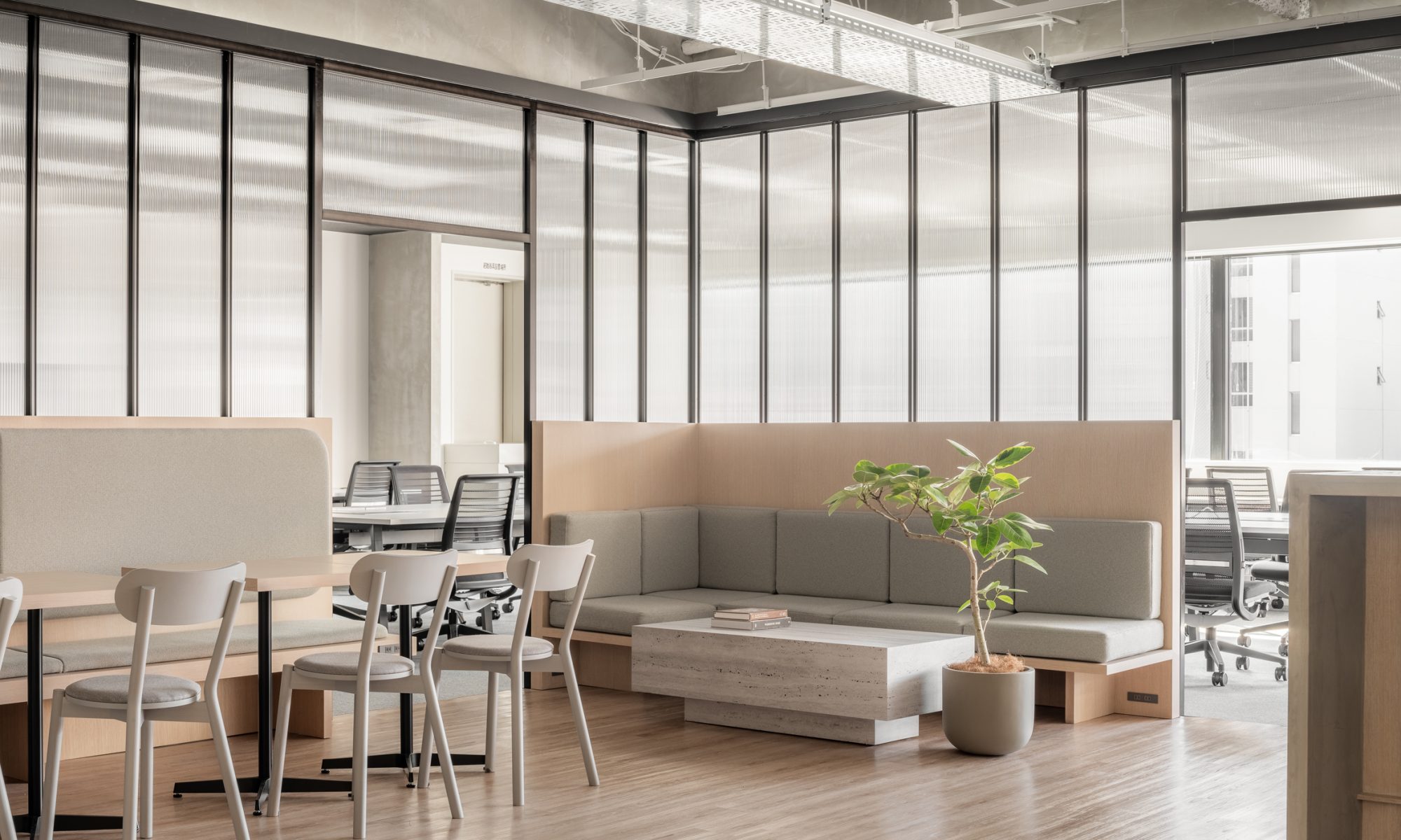
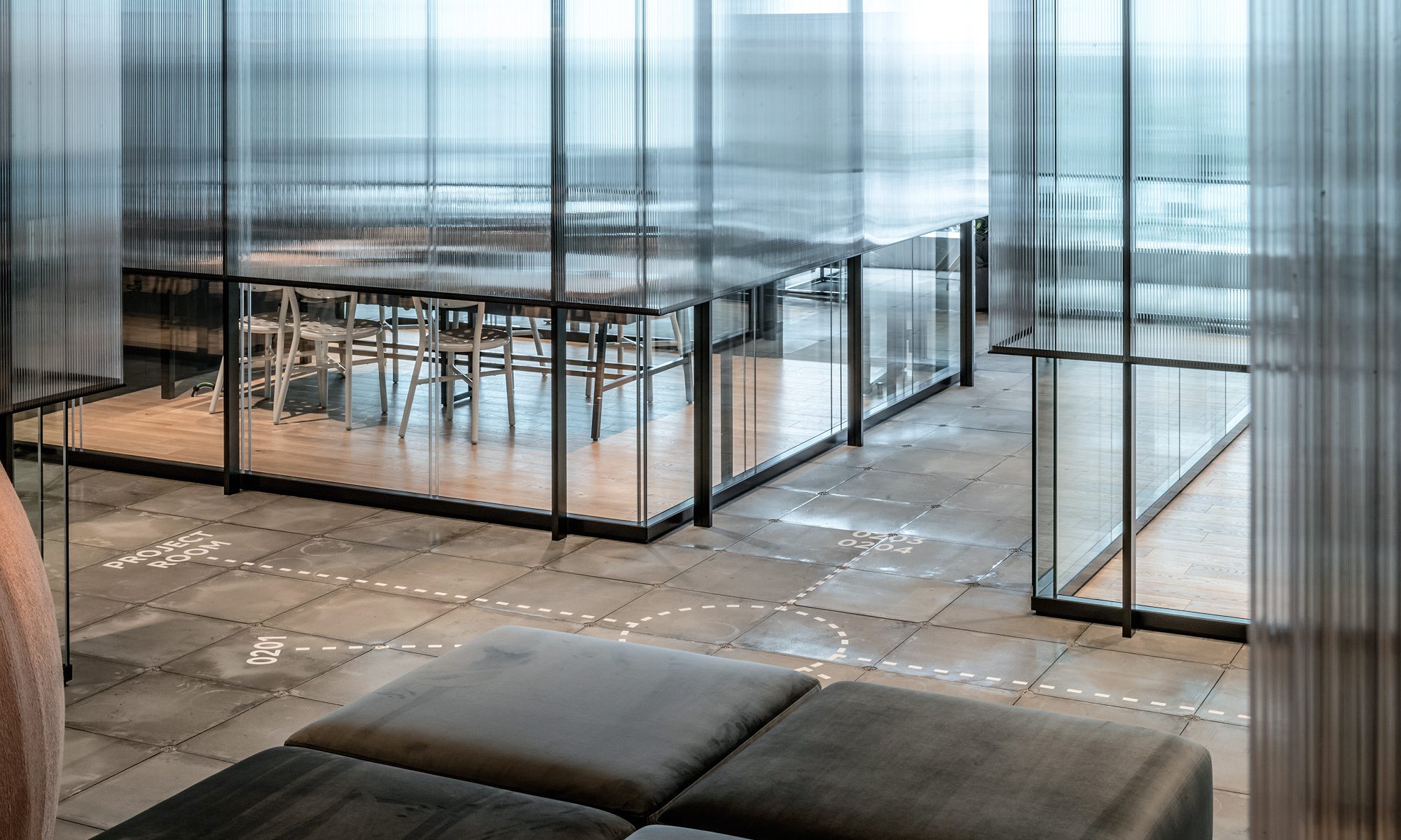
システム開発、ホームページ制作、ITコンサル、アプリ開発を行う会社の改装計画。集中して作業を行うことに特化した場と遊び心がありコミュニケーションを促進することのできる多様な場のあるオフィス空間求められた。


限られたスペースの中で収容人数と多様な場を設けるためフリーアドレスとし、作業に集中する執務席を空間の外周に沿うようにコの字に配置し、こうすることで生まれる空間の中心に会議室やパントリーなどの人が集まる機能を配置した。


エントランスから執務席、執務席から会議、外出時など全ての導線でこの空間を経由する。人が集まる機能を導線の中心に持ってくることで偶発的にコミュニケーションが生まれる場とした。


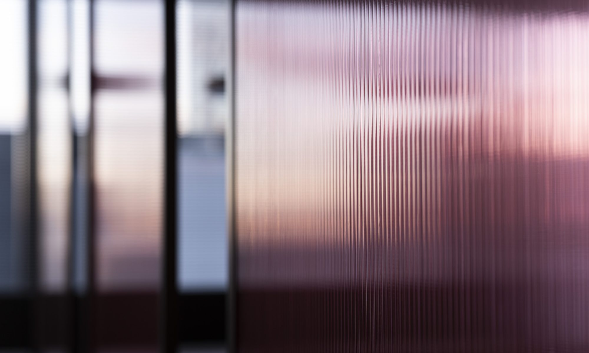
執務空間と中央のコミュニケーションスペースとを区切る壁にはポリカーボネートを使用し隔たりを持ちながらも緩やかに繋がりを持った空間とした。デスクとワークチェアが整然と並べられたモノトーンでストイックな空間とは対照的に、窓面から差し込む外からの光をポリカーボネートでワンクッション置き外光をやわらかな光として取り入れ、ダウンライトを配置せず真っ白なスケルトン天井に対し照明を当てた間接光のみであかりをとることでマットな質感の空間をつくり爽やかな心地よさを感じる空間を目指した。


Renovation plan for a company that develops systems, websites, IT consulting, and app development.There was a need for an office space with a variety of places that can promote communication and a place that specializes in working in a concentrated manner.


A free-address system was adopted to represent the capacity and various places within a limited space.In the center of the space created in this way, we have placed functions such as meeting rooms and pantry where people gather.

Go through this space on all leads from the entrance to the office seat, from the office seat to meetings, when going out, etc.By placing the function of gathering people at the center of the flow line, we created a place where accidental communication was born.


The wall material that separates the office space from the central communication space is made of polycarbonate, making it a space that has a loose connection while having a gap.In contrast to the monotonous and stoic space in which desks and work chairs are neatly arranged, the outside light that is inserted from the window surface is made of polycarbonate as the wall material, so the outside light is taken in as soft light. In addition, by using only indirect light without using downlights, a space with a matte texture was created to create a space that feels refreshing and comfortable.

NHN TECHORUS


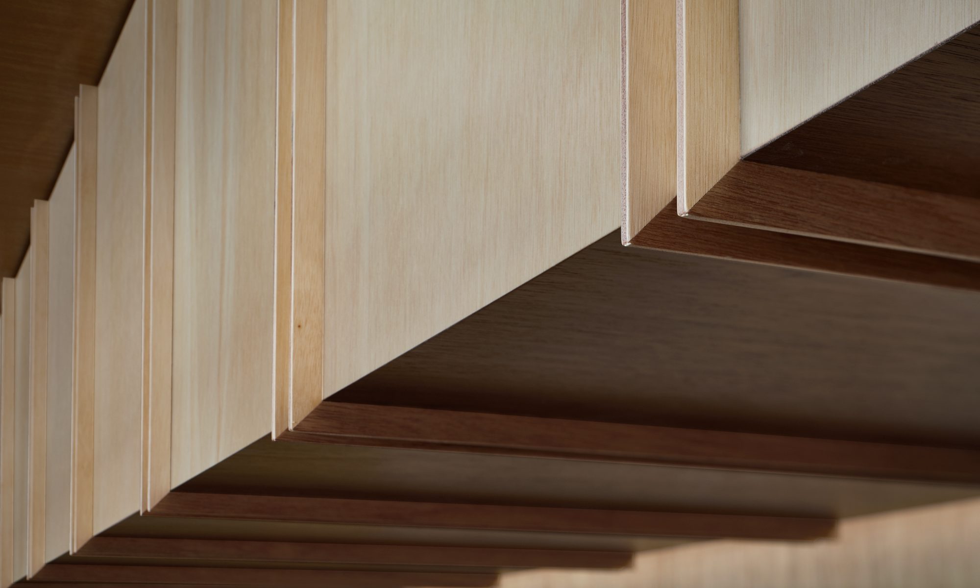
ITインフラ・ソリューション事業を展開している会社のオフィス内にあるコミュニケーションスペースの空間をデザイン。普段下地として良く仕様されるラワンをメイン素材として活用。線を意識したディテールとすることでリズム感と違和感を感じる空間とした。

Designed a communication space in the office of a company that develops IT infrastructure solutions business. Lauan, which is usually well-designed as a base material, is used as the main material. It is a space where you can feel a sense of rhythm and a sense of incongruity by using line-oriented details.

SHINGO DENZAI

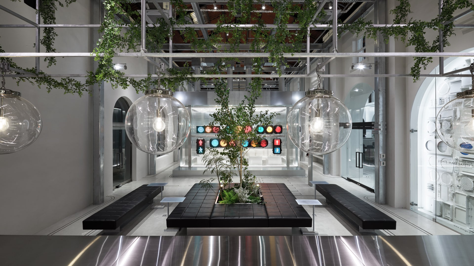
1909年に建造された煉瓦造平屋建2棟並びの変電所を信号機メーカーの本社オフィスとしてコンバージョン。

長い年月を経た建築物。既存の状態が老朽化しているが天井も高く、特徴的なアーチで構成された印象的な空間だったため、内外装ともに既存の状態に極力手を加えず整え生かし、耐震補強や求められるオフィス、ショールームとしての新しく加える機能とで対比させることで空間を構成。

新旧のコントラストが溶け合い調和した空間を目指した。

平屋建2棟並びという特徴を生かし社員が作業するワークスペースと来客やショールーム、社員のリフレッシュスペースとしての機能を棟ごとに切り分けて配置。

既存の状態を生かし求めらる機能と対比をさせるという構成は同様に、それぞれの空間に対して使用する素材を切り分けることで対照的な空間とした。


We converted brick two building one-story substation built in1909 into office of traffic signal manufacturer.


Building that has passed many years.It was an impressive space consisting of distinctive arches, with existing conditions that are old but with high ceilings.
Therefore, I made up the space by making the most of the existing state in the interior and exterior without modification as much as possible, and making it contrast with the new function as a seismic reinforcement and a required office, showroom.


The purpose was to create a space where the new and old contrasts are fused and harmonized.

Work space for employees to work by utilizing the feature of two building one-story, visitors and showrooms, functions as a refresh space for employees are divided and arranged in each building.

The configuration is the same as contrasting the existing state and the required new function, but it was designed as a contrasting space by separating the materials used for each space.

PIZZA MAFIA TOKYO


ピザ屋メインのレストランデザイン。写真を撮る様に部分を捉え、アルバムを作る様に部分と部分を構築して全体を作った。インテリアを作る手法ではない方法を試行錯誤しながら居心地の良いレストランデザインとなる様にデザインしています。


Pizza main restaurant design.I caught parts like taking pictures and built parts and parts to make an album like making albums.Designing it to be a cozy restaurant design while trial and error methods that are not methods of making interiors.

LINE OFFICE

LINEの持つ様々なコンテンツ、フィロソフィー、スペースストラテジーを具現化できるオフィスを構築。ロード、アレイ、インターセクション、ストリート等々、多様なファンクションを包括できる道をオフィス内に散りばめる事で実現させています。

We have created an office that can embody various contents of LINE, philosophy, space strategy.It is realized by scattering the way that can comprehensive functions such as roads, alleys, intersections, and streets in the office.